


To onboard existing Pandora users in the new on-demand world, highlighting the new changes in the app they’ve used for years and reassuring them their stations are safe and sound.
I was the lead designer working closely with a PM and another designer to scope and design this onboarding flow. I worked on sketches, wireframes, visual design and an animated prototype to simulate the experience.
By upgrading (from a station-only product) to Premium (on-demand world), people are welcomed to a radically different app. Where before you could only create and listen to a radio station, now you are free to search and play whatever you want, create playlists, browse for new releases - an exciting but overwhelming world.
We want people to join the on-demand world and have an fun, exciting and seamless experience. How to achieve that?
To reassure listeners their old stations are still there
To inform on the main changes in the UI they used to know
To give listeners an easy way to play music right away
The project kicked off with conversations with our PM, where we talked about different user-cases (first-time using Pandora or loyal station listener?) and discussed the most important features we wanted to highlight. Having the team on the same page on those details helped us focus and start the design explorations in the right direction.
With clear goals, a set of user cases and constraints, it was time to generate as many ideas as possible and bring them to the team. By looking at them together we would quickly discard the bad ones and improve the ones that looked promissing. After a couple iteration cycles we had a strong solution we wanted to try out.
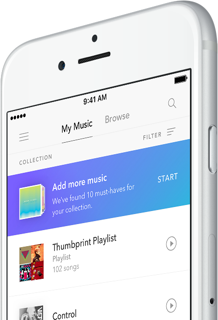
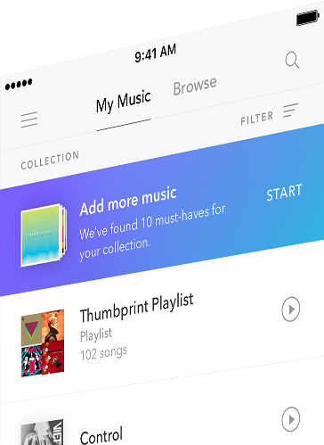
My first design exploration involved an idea where listeners could quickly and easily add albums to their collection upon upgrading with one tap. The rationale was that a listener would become more engaged in the product if he had a personal library to come back to (sense of ownership).
This hypothesis was supported by data from Rdio: listeners who added music to their collection would use the app more often than listeners without a library.
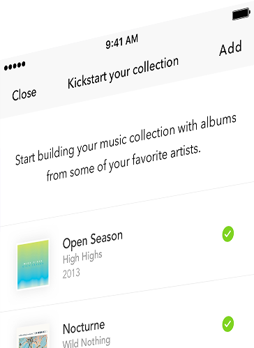
I built functional prototypes and had our researchers run user testing sessions with 9 users. We observed the concept didn’t test well with users due to a couple reasons:
Albums vs songs: Some users were album listeners, but many preferred individual songs.
They expected to see recommendations, not music
from artists they already liked.
Users weren’t ready to commit to adding content to their collection immediately after upgrading.
Our competitors tend to be very impersonal - particularly after upgrade, when little is known about the user to provide personalized, accurate recommendations. Pandora Premium has an advantage over other services: when listeners upgrade from one of Pandora’s other tiers, they carry their listening history with them, which means we can start serving them a personalized on-demand experience immediately after upgrade.
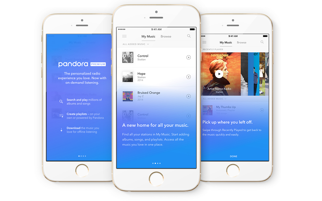
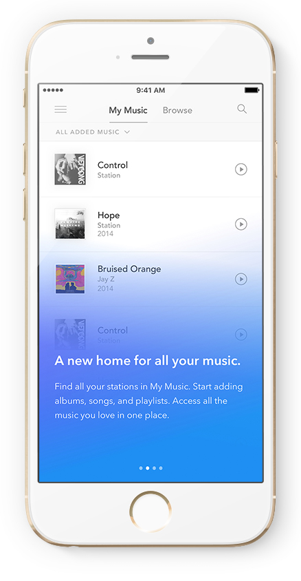
Based on the feedback we’ve gotten, I changed directions and explored a simple tour that would start from a comfortable place from the listener perspective (my music library) and then leave it open for exploration, making it easy for them to start playing music right away.
I used Pixate to prototype so we could test it on users. This felt like the right tool at the time because motion design was fundamental to tell the story.
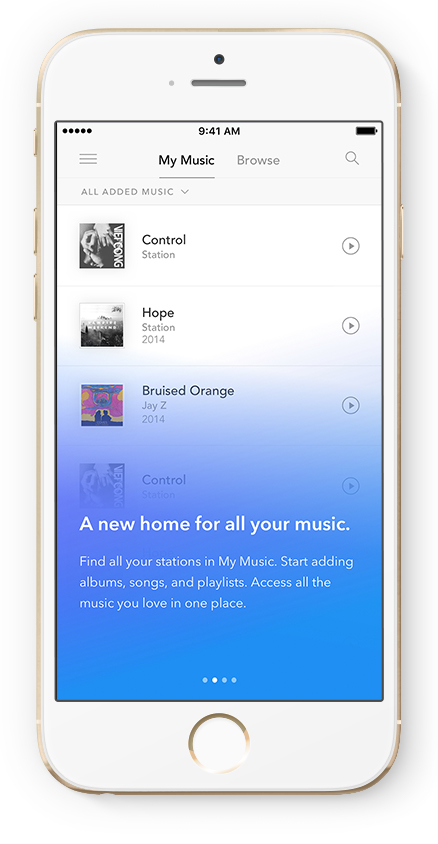
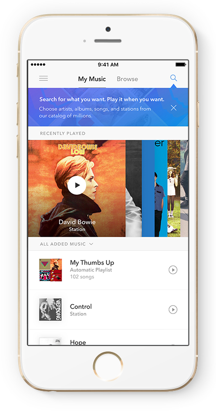
The tour accompanies a “build” of the listener’s My Music screen. It allows listeners to learn the new interface, while also showing them how their previously created stations exist in the new Premium experience. Usability testing indicated that this type of “warm up” to the new product helped listeners understand that they were transitioning into a new Pandora experience while also introducing them to new features.
After getting positive feedback from user tests, the team was satisfied with the design direction and I spent some time working on polishing the visual design.
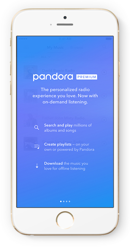
This screen is designed to confirm that the listener is now a Premium subscriber while reinforcing Pandora’s new on-demand features.
This screen is designed to confirm that the listener is now a Premium subscriber while reinforcing Pandora’s new on-demand features.
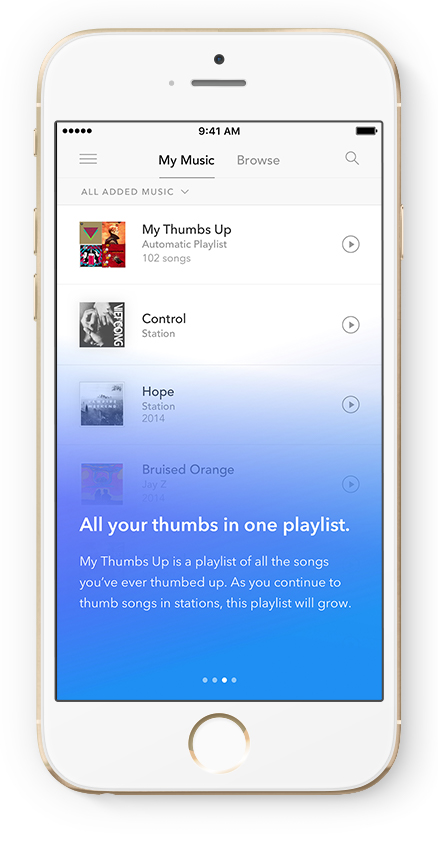
Upon upgrade, we’ll show My Thumbs Up playlist dropping into their collection. It’s a playlist automatically created containing all the songs listeners ever thumbed up from stations. During usability testing, participants loved the My Thumbs Up playlist concept.
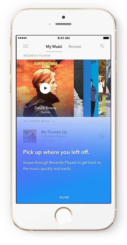
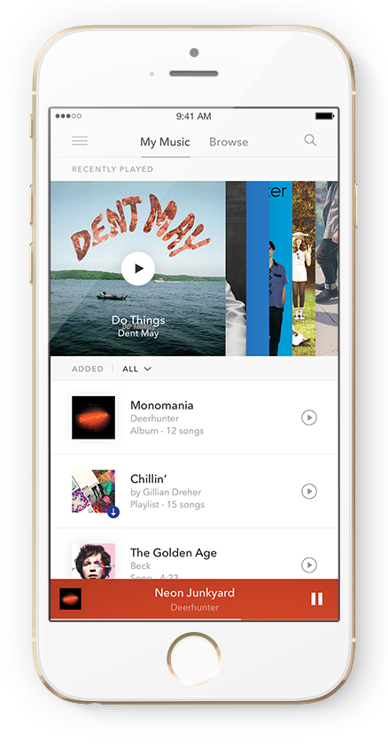
This screen explains the new Recently Played area of My Music. Albums, stations and playlists are added to this carousel for easy access later, if the listener wants to keep listening to it.
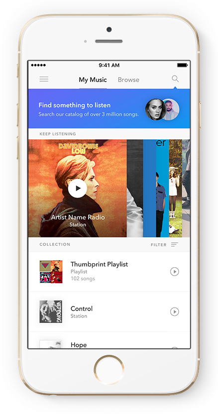
The last step is not really part of the tour, but a important detail to help guide our listeners to one of the most important features in the on-demand world: search and play whatever is in your mind!