


To create an app that put existing Thumbtack product features in native iOS. Considering that most consumer requests come in during business hours when professionals are out on jobs, having a mobile app enables Thumbtack to deliver quotes quickly and the pros to quote quicker and easier. More than 50% of the requests are viewed on mobile by professionals.
I was the lead designer working closely with PMs and engineers to scope and design the features in the app. I worked on sketches, wireframes, prototypes, visual design an ran user interviews for the main flows of the app.
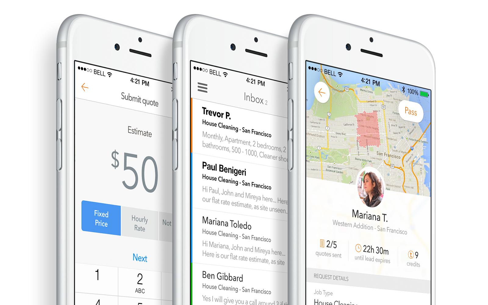
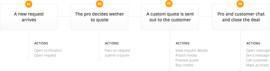
The main flow is simple and composed of 4 steps: A professional receives a consumer request and decides wether to quote, then he submits a quote and finally he communicates with the consumer to get hired and complete the job.
The process beginned with sketches that evolved to an iterative prototype. I then led a couple user interviews to validate those and learn where to improve. After a few rounds of iteration, I had a solid base and moved on to a polished visual design and generated another interactive prototype to test with our professionals.
I created the concept of an Inbox to help our users organize all their quotes and requests within Thumbtack. These information used to be spread around the dashboard - a clear could be better. With the new Inbox, the pros would have their current jobs, new requests and prospects all in the same place. Easier to find, easier to understand.
Professionals have three types of content in their inbox: requests, messages (including quotes - a quote is the first message in a conversation) and updates. Updates are considered customer actions and therefore are sent to the top of the inbox.
Common updates are: customer has viewed a quote; customer has marked pro as hired; request has been cancelled; customer has hired another professional etc.
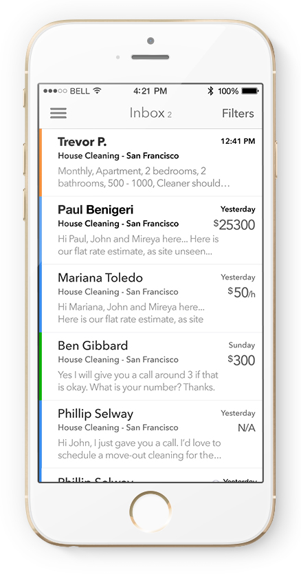
To create a clear visual distinction between different stages in the lifetime of a request, we are using different colors. They are specially helpful when looking at an unfiltered inbox: with a quick scan you can identify the nature of the message. These are the colors and what they represent:

I used Pixate to prototype a feature that our users have wanted for a long time: the search. Interactive prototypes are very helpful in order to communicate an idea to team members, stakeholders and ultimately to users in on-site interviews.
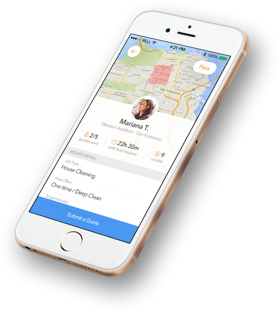
It all starts with a work request from a customer. Professionals are notified and have to study the request in order to determine wether to (pay to) submit a quote to that job or not. It’s a huge challenge to design one request screen template that works for hundreds of different categories (from house cleaners to djs), and with this
solution I focus on communicating the specific needs of the customer, his location and give a sense or urgency - how many other quotes from other professionals have been sent and how long until this request expires - all important factors for pros to quote accuratedly or at all.
I can’t reinforce enough how important it is to prototype the details you have in your mind. It makes it easier to engineers not only to build it the way you intended, but to understand your idea and give feedback, improving it. Those small details add up to create a delightful experience to the users.
What’s the best way to show professionals multiple new requests and make it easy for them to scan and quickly discard the ones they’re not interested in and pick the ones they want? I used Pixate to prototype a Tinder-like navigation that does exactly that.
At Thumbtack, customers request professional services to accomplish their goals - from house cleaners to wedding photographers - by filling out a detailed form telling their specific needs.
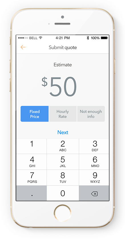
I used a toggle to help the users quickly select the price type they wanted for a specific work request. We also have a smart default based on the most used price type for that professional.
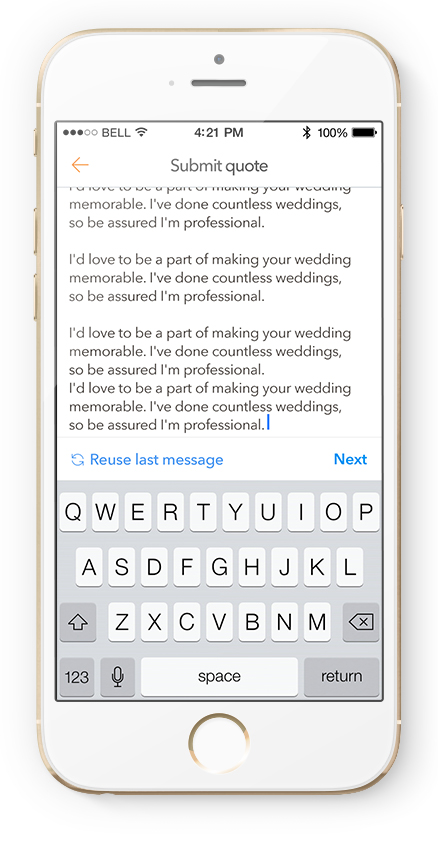
We want our users to address the customers needs and write personal messages to them, but the data tells us they reuse messages as templates most of the time. The UI always shows them the most important actions.
The app has been a success and we already have many ideas on how to improve it. The users are very vocal about what they need and it helps us to make it better.
 Download the App